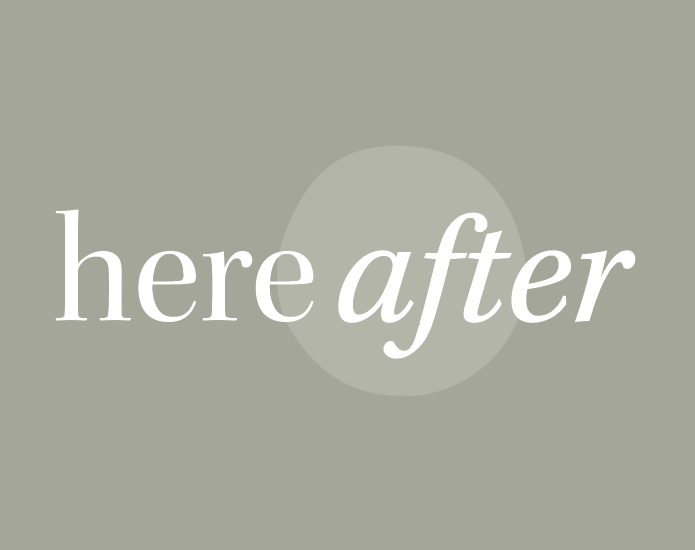
Branding
Background
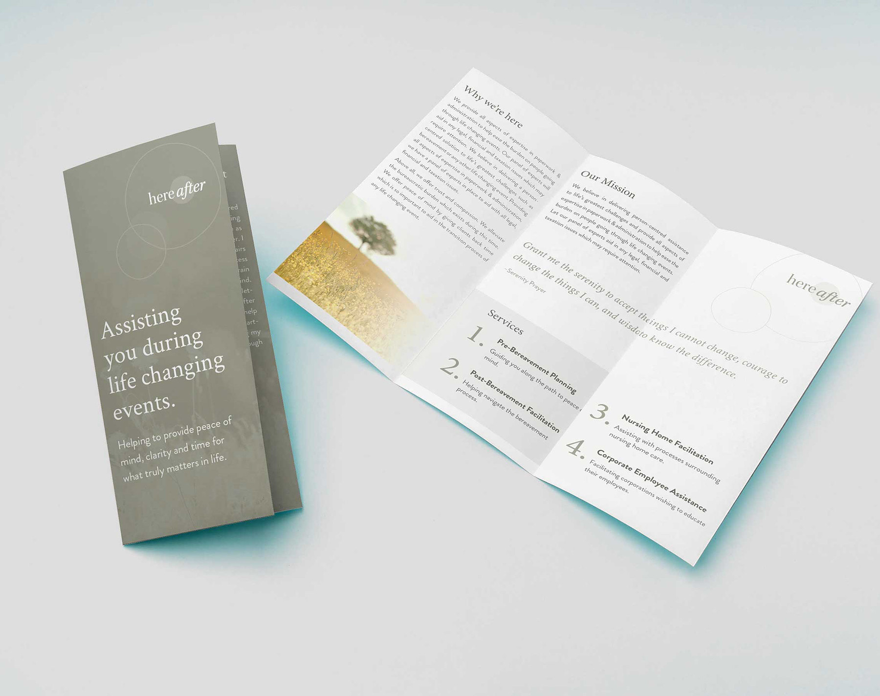
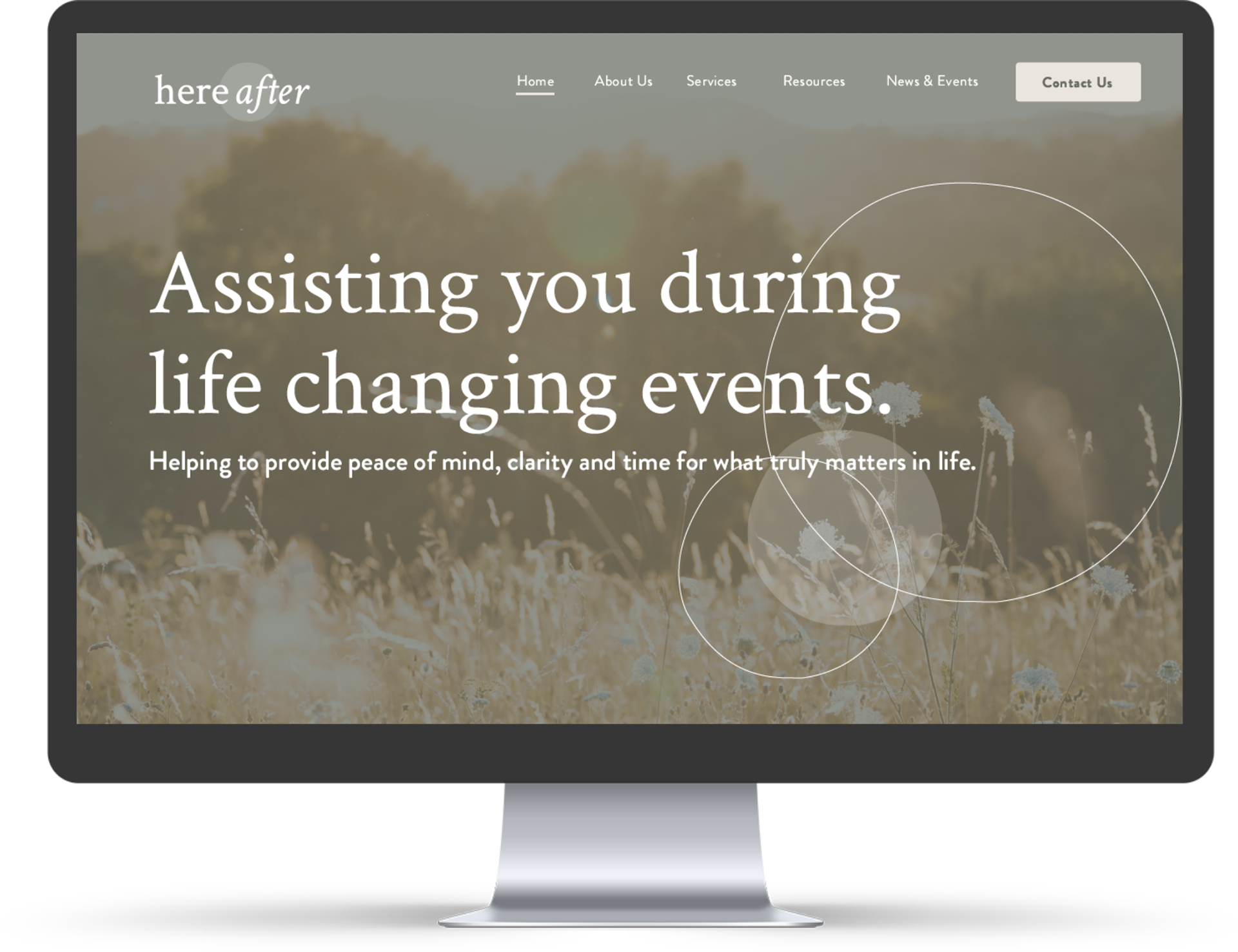
Hereafter believes in delivering person-centred assistance to life’s most significant challenges and provides all aspects of expertise in paperwork and administration to help ease the burden on people going through life-changing events.
Challenge
To develop a professional brand and visual identity sensitive to their client's current distress and challenges.
Solutions
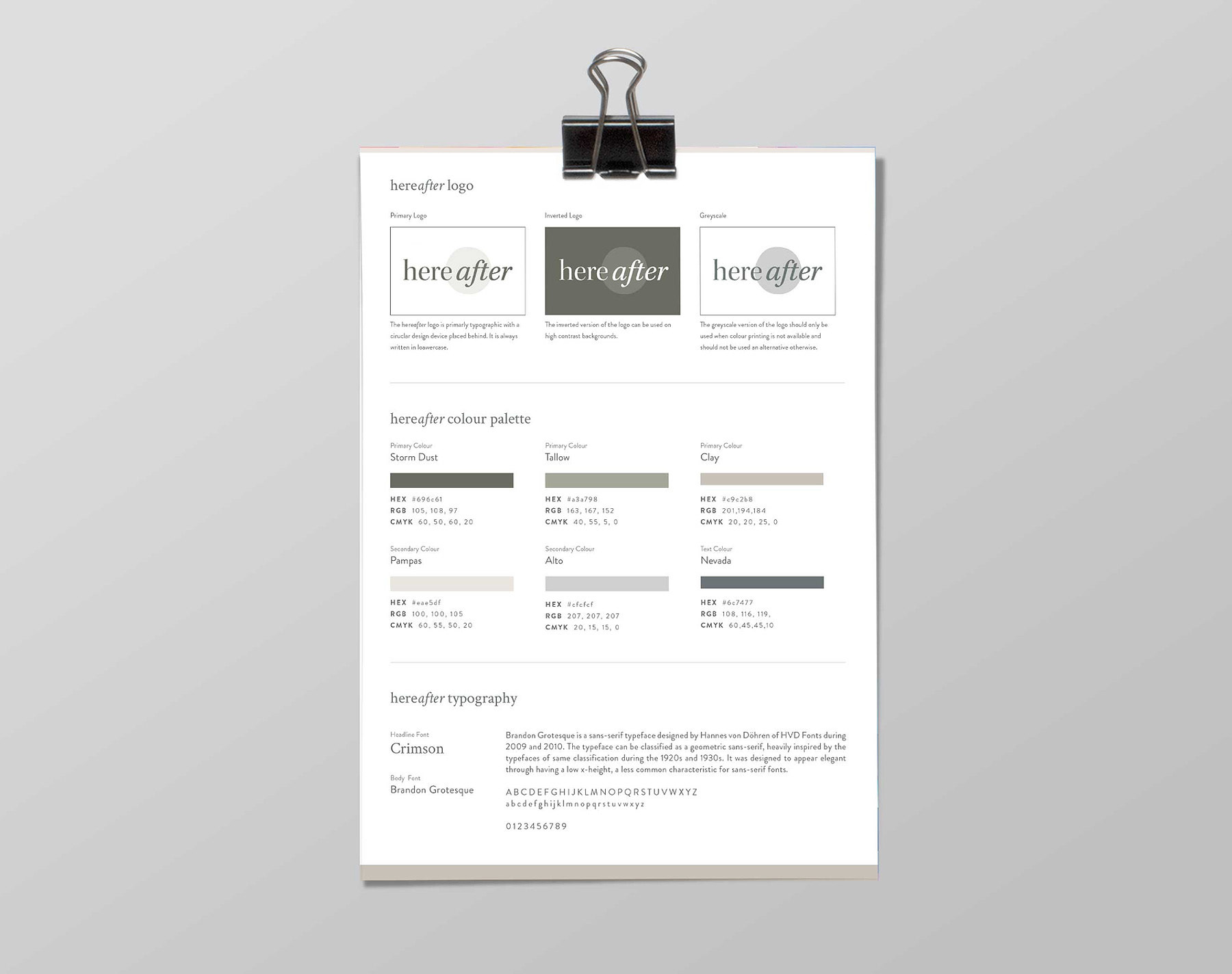
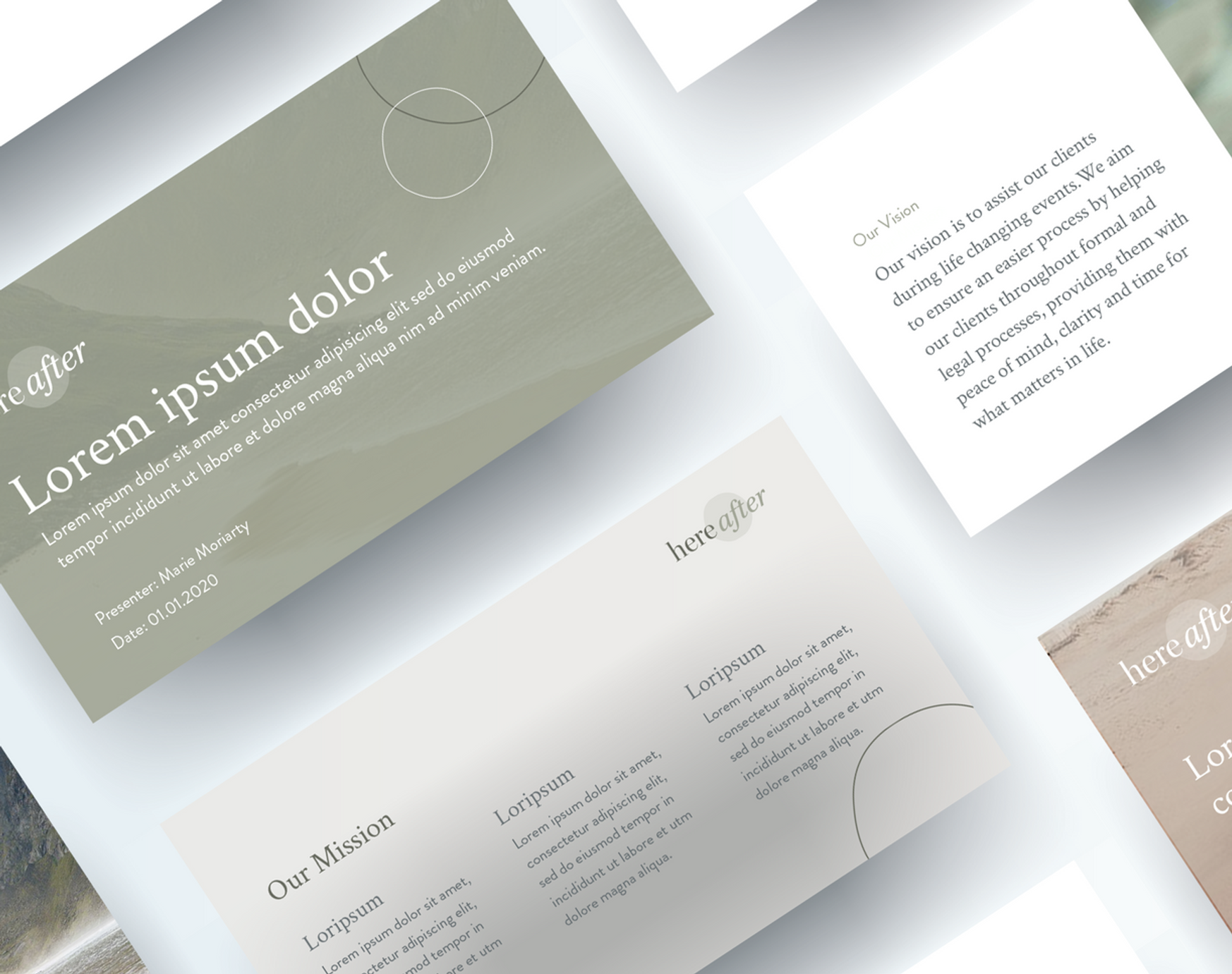
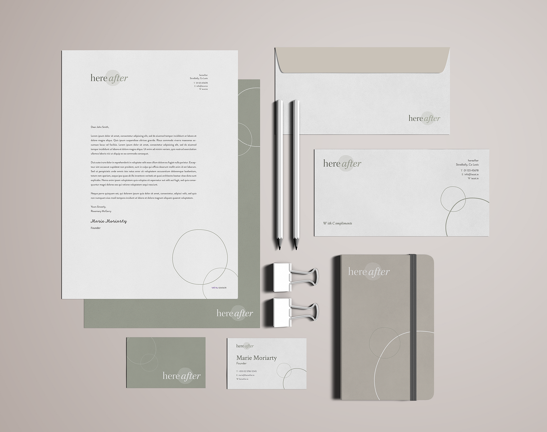
The visual identity for Hereafter is symbolic of the roots of the business. The logo for Hereafter nods to the memory of Marie’s dad, Sonny, whose passing inspired Marie to create a unique and compassionate service for people going through similarly difficult situations. The circle design device, used throughout, represents the positivity of a new day while also representing notions of totality, wholeness, and cessation. The colour palette is sympathetic, inspired by the Irish landscape.
Testimonial
I didn’t even have a business name when I started with Cat, her ideas and creative skills came to the fore to help me find one. She went over and above on many occasions to guide me on the right path. Her patience, kindness and compassion shine through every time I speak to her.
Marie Moriarty