Branding | Website Design
Background
Pam Rubin is an amazing master of words and provides copywriting and proofreading services.
Challenge
Pam came to me as her current website and branding was not effectively communicating her unique personality to her desired target audience.
Solution
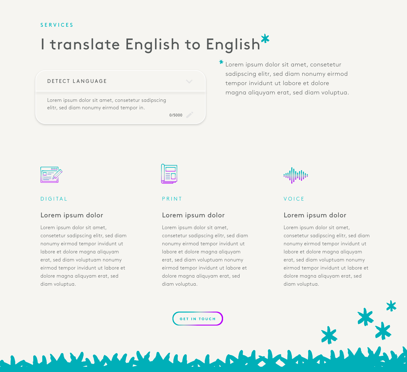
Throughout several workshops and conversations, we honed in on her unique writing abilities. We created a fun and engaging brand and website that would support her in resonating with her intended audience.
Pam currently goes by "business poet" and felt like she was hiding behind the name, but we didn't want to lose it completely, so I worked on bringing Pam to the forefront.
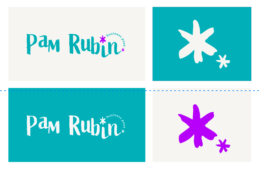
Through our conversations, Pam developed some interesting key messaging that had some clever and more profound meaning. This is reflected through the asterisk symbol, which is used playfully but meaningfully throughout the website design. While the branding is colourful and fun, the prominence still remains of what Pam is saying, which is critical when relating to her current audience.
Logo
Logo Variants
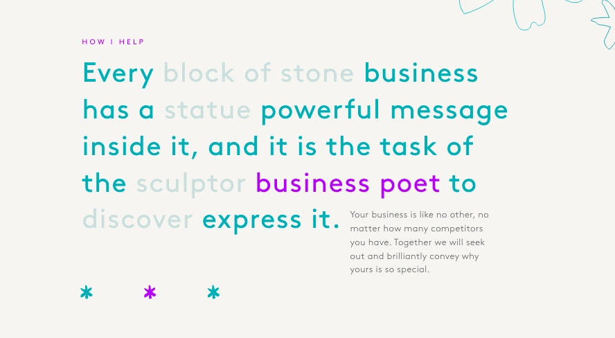
Messaging
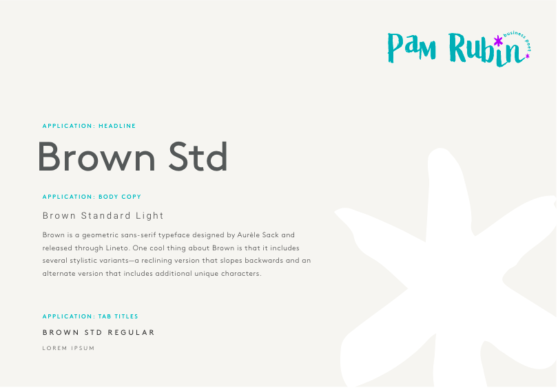
Typography
